
Eurostat is the statistical office of the European Union. It gathers together the statistics from each member state’s statistics office, like our own CSO and aggregates and analyses from there. They’ve been making great strides recently towards making the data as accessible as possible and providing a number of visualisation tools and mapping resources. One such recent effort is their Energy Dashboard. There’s a lot of data from members states (energy productivity, efficiency, GHG emissions etc) here. But the visualisation tool makes it easy to select and compare across countries and categories. If you wish, the raw data in csv or excel format is also available for download.
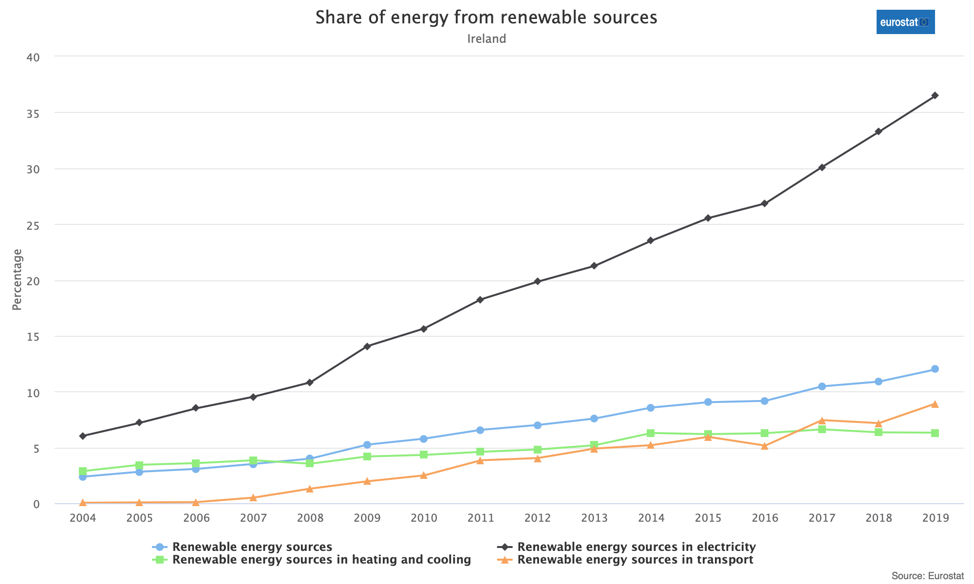
Some broad trends here are the growth in renewables sources of energy production and the gradual declines in household energy use from highs in 2005-2010. On this latter category, household energy use data goes to 2019. I wouldn’t be surprised at an increase for 2020 with the increased amount of time we’ve all been spending in our homes. Similarly, GHG emissions from energy emissions have fallen over the last thirty years here with what looks look like a plateauing of emissions from 2015 until the last year for which data is available in 2018.
